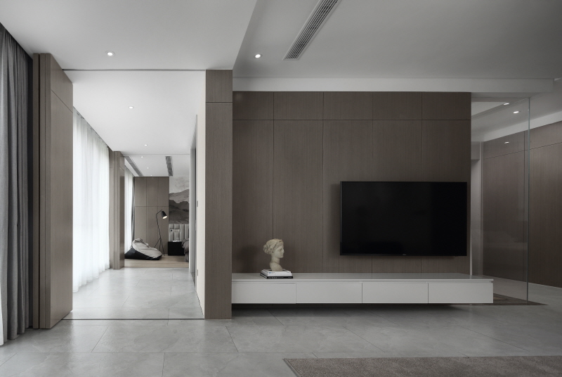
The case is given the title as“Back to the origin”,just as what the attitude we should both have in life and in work: face to the past unswervingly and look forward brightly to greeting the future; have your own opinions confirmingly and do not drift with the current; no need to stick to the details and focus on what we should put more effort to.In the end, by the reincarnating of the time, all is back to the origin.
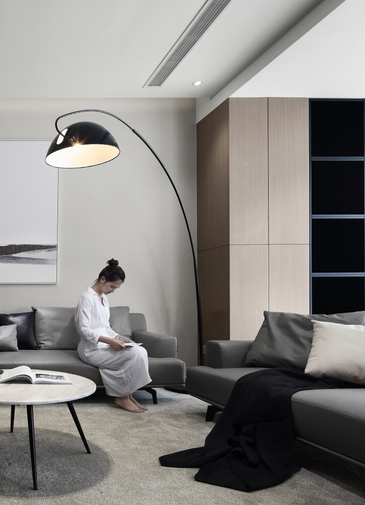
Space is the continuous growing object, and it can be varied with temporal and spatial changes by people's behaviors. Based on this principle, what we should do is to make sure that most of the space is utilized reasonably to be seemed as unlimited, to reduce the waste of space from traditional segmentation, to give users more opportunities to do further communication and interaction. What’s more, to keep and ensure owner’s privacy is the most fundamental rule for designer to consider.
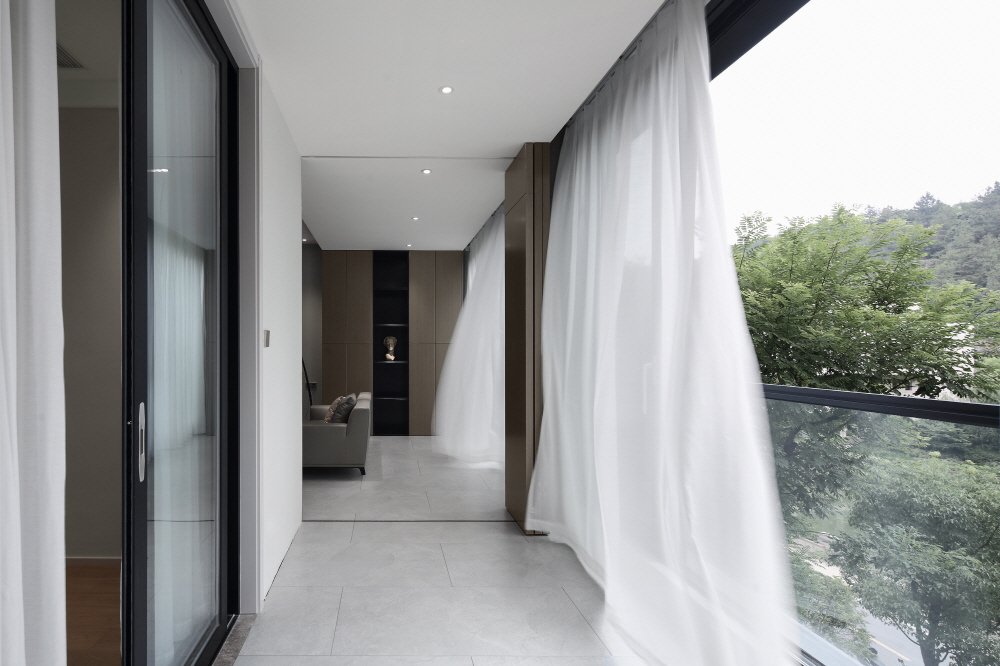
The whole construction is surrounded by mountains and rivers. It holds a design concept of both natural and hominine integration. It not only gains the interconnection with the outdoor and the indoor, also realizes eco-friendly and natural harmoniously to select on the decorating materials.
Using the simple linear geometric spatial structure, and abandoning the complicated art decoration is to create a pure living space for the owners and to accommodate the requirements. Design should be a means of life guiding, not just showing the layout performance or art aesthetics.
Lobby
Lobby is connected to both dining room and living room. The cabinet design allows the long narrow generatrix to get a visual focus, and it balances the spatial experience between dining room and living room.
Living room + Corridor
A mobile wooden folding door balances the publicity and privacy. Linked balcony increases the sunlight surfaces. At the same time, moving track makes the full encircling structure, which makes the castle view becomes more open, and shows the greater integration from the natural and the interior.
Bedroom
It has weakened a definition of the private and the public.The bedroom looks like more flexible and the moving track feels like more strengthened. The outside scenery is presented statically by bedside background in order to strengthen the interaction between the interior and the exterior.
Kitchen + Dining room
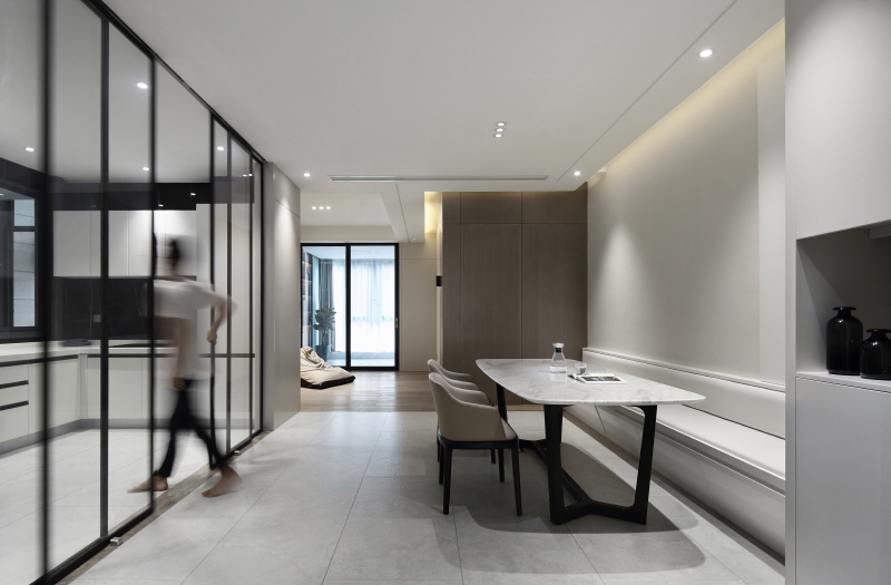
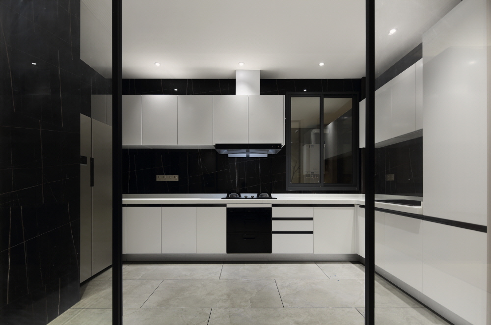
The white space in both kitchen and dining areas demonstrates a clean and capacious state.These functional areas present a capable and experienced quality after highlighting black and white tone.
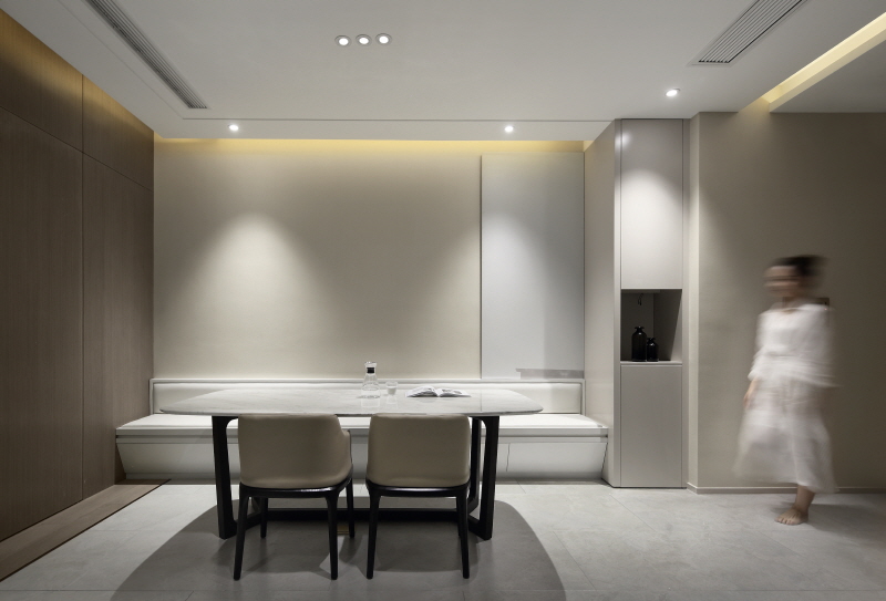
Using booth to enrich the variety of the dining area, which provides more space for leisure.It means that except living room and balcony, users have much more extra space to rest. This user-friendly arrangement satisfies the diversification and humanization.It seems quite simple but not monotonous at all.







0개의 댓글
댓글 정렬