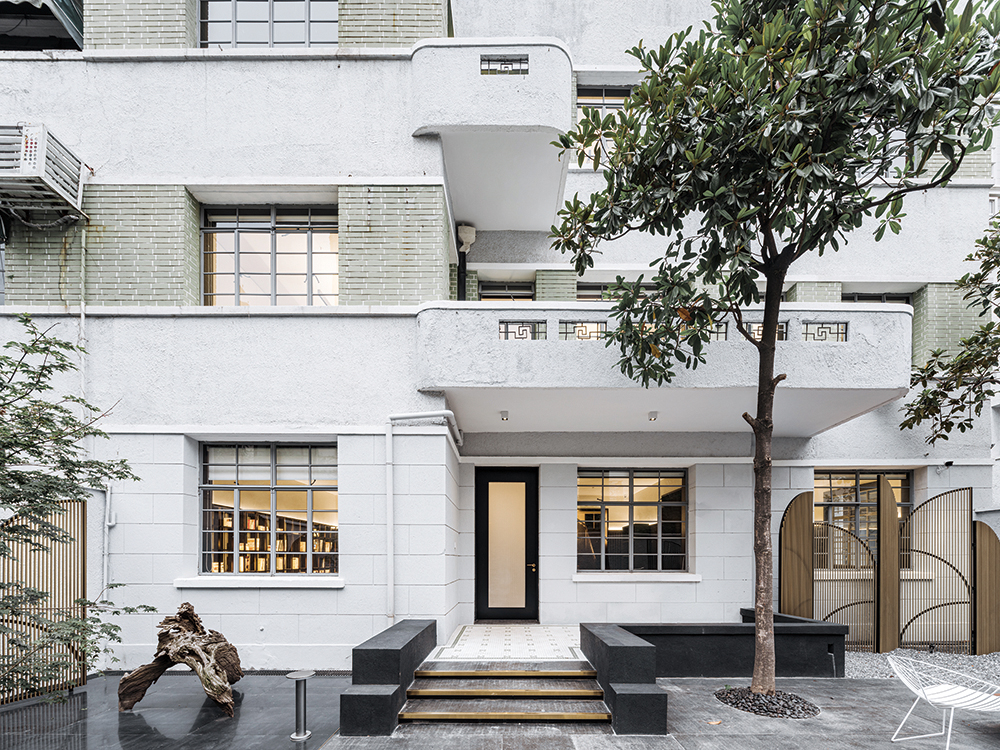
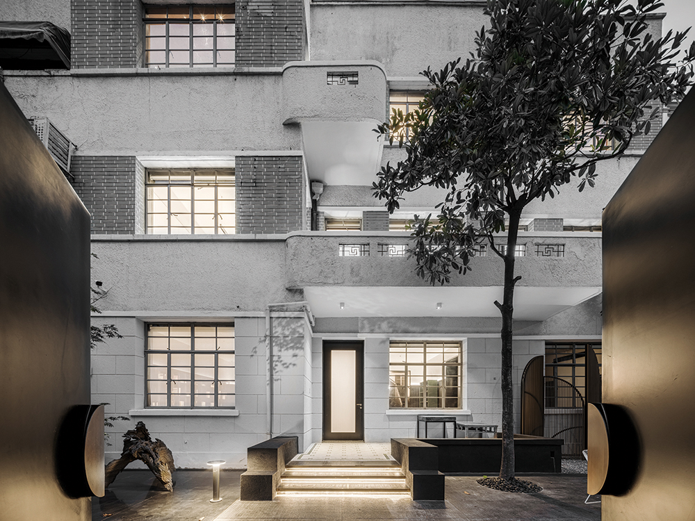
Wutopia Lab was commissioned by the client to reconstruct an old house located in the heart of Shanghai into a secret place including a courtyard, a miniature private gallery, home office and residence, given the fact that no structure was allowed to be modified Originally contained six families, this old house has a complex space layout with four small bathrooms and two kitchens. The housing management department stipulates that the facade, structure, room function, old mosaic tiles, old wooden floors, and trees are immutable. Restrictions do not allow architects to make a big difference in form and space, but give architects an opportunity to trace the basic elements of architecture. Since it is not possible to change the layout, color is used as the independent and unique basic element of the design to shape the spatial texture. We use different textures and depths of black and white as a set of relationships as the main color of the house. When black and white ash is absent, the tone, line, contrast, and contrast between light and dark may be a choice to shape the space.
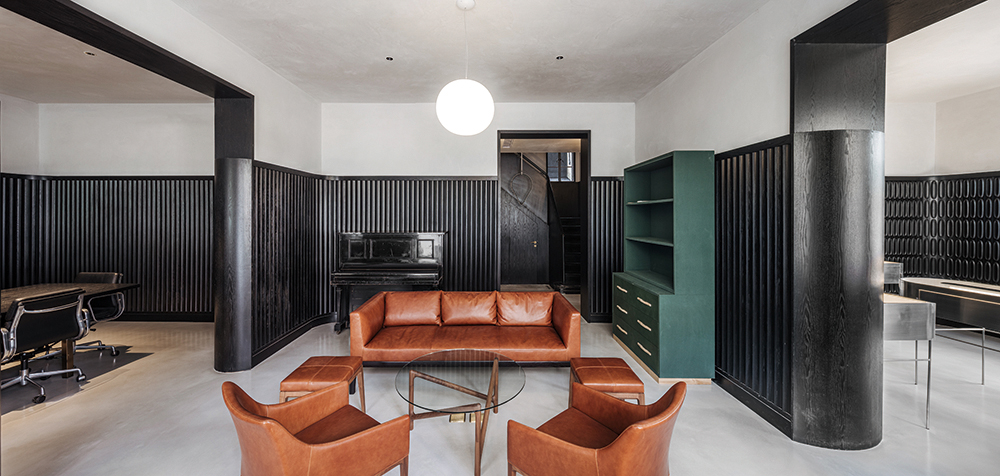
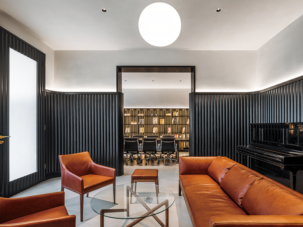
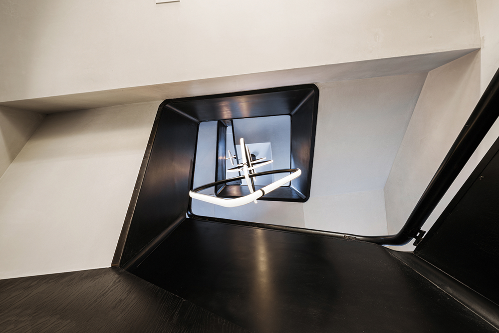
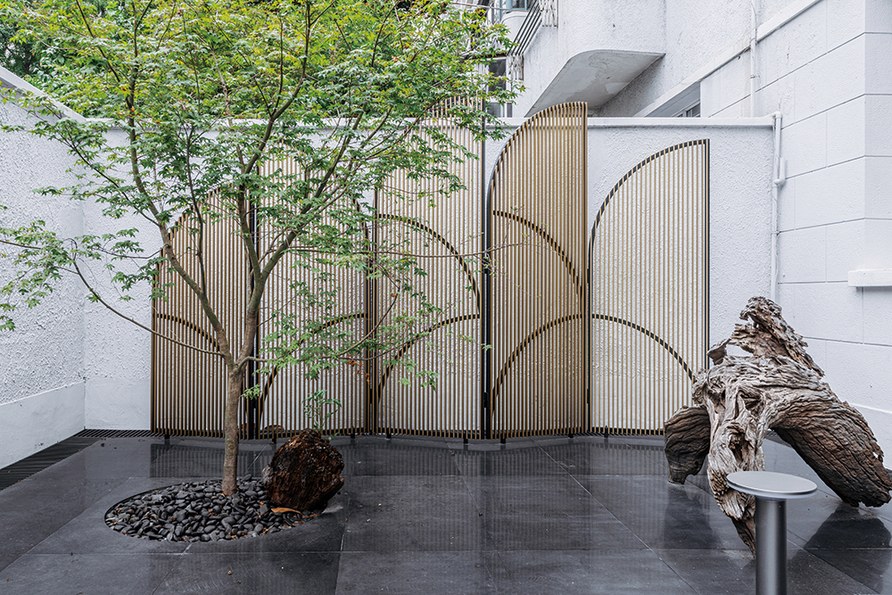
We removed the unneeded doors. The closed and independent dark pattern formed by the multi-family residence turned into a richly-spaced space with a light connection because of the opening of the door. It includes a wellconnected light well, a galley without a gap, and a three-open office area with a line of sight. Continue the courtyard color of our previous project, House of Twilight, we use black ink to render the courtyard, and highlight the three old trees that remain. We use matte, glossy and black marble and dark gray gravel as the black for different levels. And by this point, the addition of the Japanese maple, Japanese maple and dahlia. This modern courtyard has a Chinese meaning. On the three sides of the courtyard, a tulip-like brass grille screen is placed, and the original unchangeable wall is visually separated from the courtyard as a background, and the temperament of retaining the facade is quietly rewritten. We regard the courtyard as part of the facade and interior space, which can be subtly change the feel of the facade and become the prelude for the interior. The miniature gallery on the first floor is the main space of the entire house, it’s in a relationship of positive and negative with the courtyard. The three spaces of the gallery are wrapped in a continuous black wall skirt, and the difference in the pattern of the wall skirt implies a functional distinction between the living space, the exhibition hall and the social space.
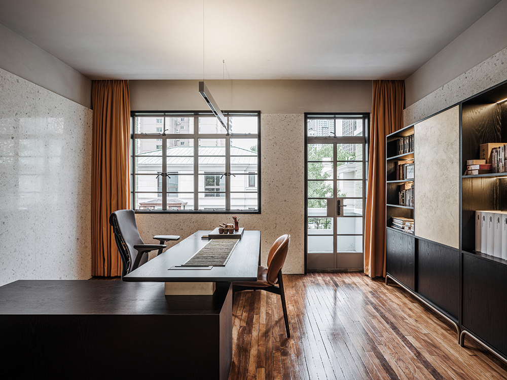
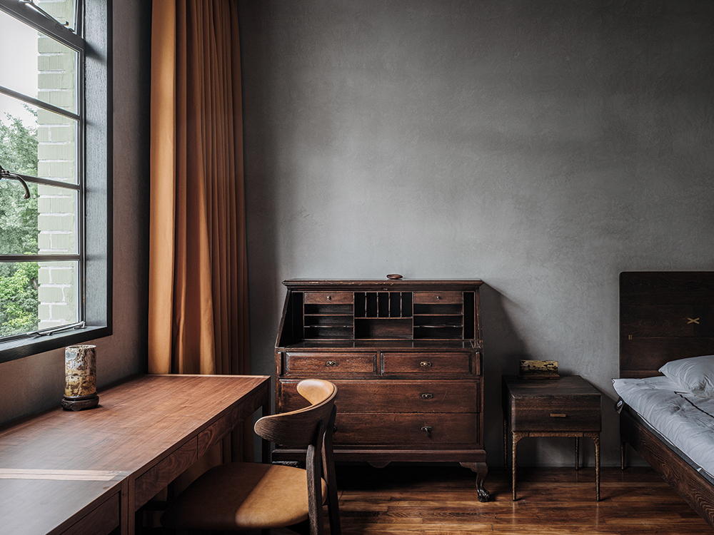
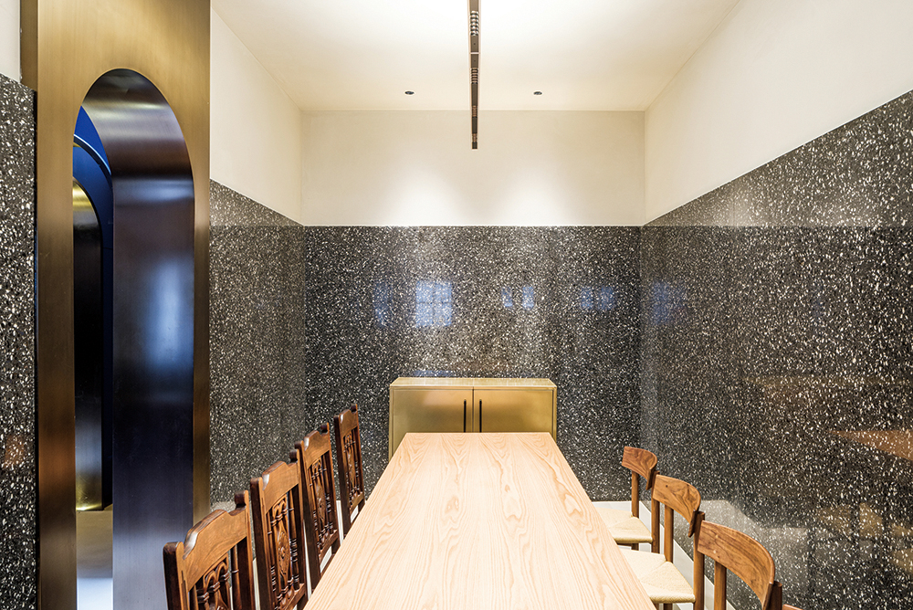
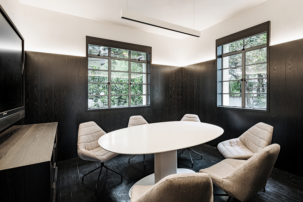
The first floor gallery used a two-meter-high black wood grain wall skirt with three different textures, as well as a beige white stucco ceiling and a grey disc multi-grinding. The second-floor office area is shaped by a glossy black wall skirt and a refurbished narrow strip of old, white walls, the most contrasting color combinations. The three-level intimate resting space is a medium-gray environment with black and white terrazzo and rough medium-gray stucco and narrow old floors combined with old furniture. The meditation room on the top is in gray, reducing the intensity of the light. So the Hypocam house finally visually showed the graininess of black and white film. The materials and colors show the difference in space and texture of the subtle layers layer by layer. Different from the aggressive magical realism image formed by the artistic treatment of daily forms in Wutopia Lab’s public space project, private home customization presents the retreat and subtraction of daily forms to highlight some thoughts hidden in daily life. Memories, and finally pure life. This is also a manifestation of magical realism architecture.
한상록
저작권자 ⓒ Deco Journal 무단전재 및 재배포 금지




0개의 댓글
댓글 정렬