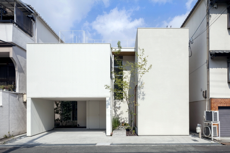
오사카 주거 밀집 지역에 위치한 House in Matsuyacho는 어린 시절을 이곳에서 보낸 클라이언트의 요구에 따라 친숙하지만 새로움이 더해진 공간의 협소주택이다. 주택들로 빽빽히 둘러싸여 있는 부지로 인해 클라이언트는 오랜 시간, 부족한 자연 채광과 문제가 되는 집 안 습기로 어려움을 겪어왔다. 이에 새로운 구조로 탄생한 House in Matsuyacho는 높게 위치한 창문과 집 틈 사이로 산들바람이 원활하게 유입되고, 풍부한 채광이 실내로 들어와 쾌적한 생활 환경을 유지한다. 편안한 환경뿐만 아니라 유니크한 외관 디자인으로 더욱 특별하게 완성된 주거 공간은 외부 한편에 자리한 정원과 독특한 공간 구조로 입구부터 화사한 느낌을 가진다.

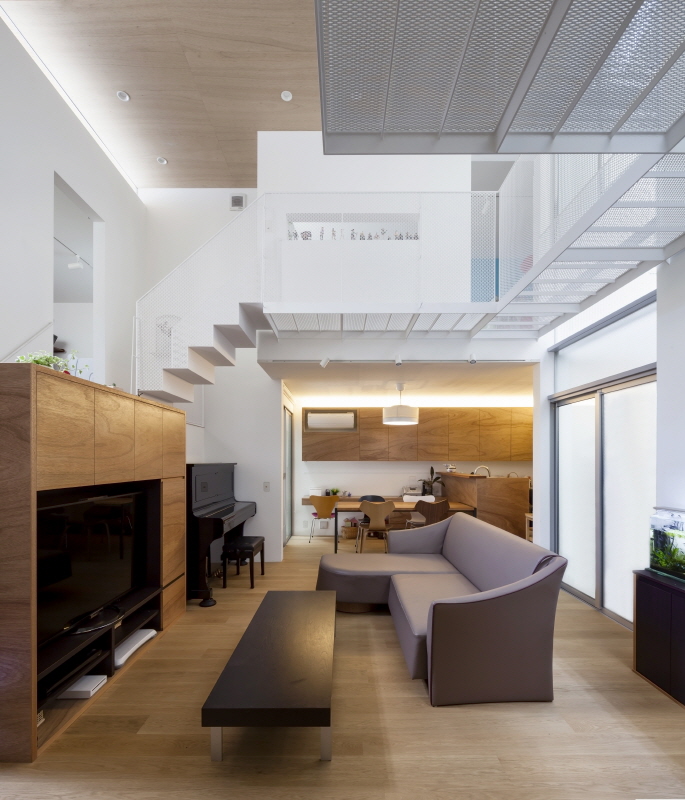
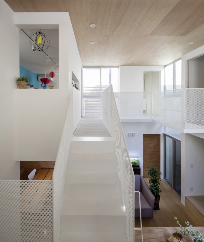
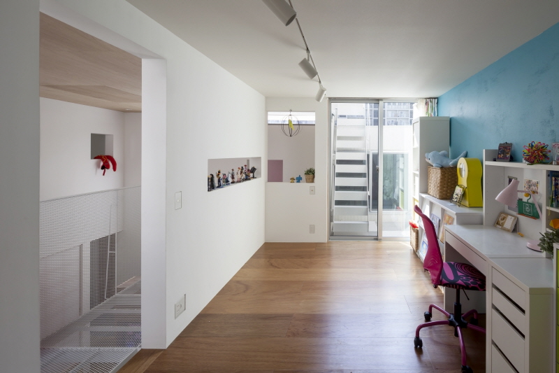
미니 정원을 지나 내부로 들어서면 아늑하면서도 실용적인 생활 공간을 만나볼 수 있다. 화이트를 베이스로 한 벽면, 계단, 중층과 원목을 사용한 바닥, 천장, 가구 등은 일본 특유의 따뜻하고 정돈된 분위기를 풍긴다. 실내는 기능에 따라 침실, 공부 방 등 네 가지 공간으로 나누어 실용성을 추구했으며, 모든 공간은 중심부에 위치한 거실과 연결되어 편리한 동선을 갖추고 있다. 또한, 각 공간마다 충분한 채광을 얻을 수 있도록 창을 만들어 거실에는 사방에서 따스한 빛이 들어와 집 안 전체에 밝은 분위기와 쾌적한 환경을 조성한다.

This property is located in a densely developed residential neighborhood of Osaka. The client had lived on the site since childhood, so when he commissioned us to design a new house there, we began by soliciting extensive input from him because he of course knew the characteristics of the site intimately. Following these discussions, we decided we wanted to build a house that would enable him to discover new things within this familiar place. The property is boxed in by neighboring houses. The space between the structures is just wide enough for a person to pass through, and is further obstructed by air conditioning units and water heaters on the exterior walls. Probably due to this environment, the client had struggled for many years with a lack of natural light and problematic dampness in the house. Setting the new structure back from the surrounding properties would have allowed in more natural light, but this type of design would also have introduced an alien element into the neighborhood, and we therefore did not feel that it was the best solution.

Instead, we sought a design that intentionally maintained the densely packed atmosphere. The solution we arrived at was to build out as close as possible to the neighboring houses, tracing the silhouette of the previous structure, but to also carve out small gardens on three sides. The breezes that pass down the gaps between the houses enter these concave gardens, flowing into the interior along with natural light. A similar hollow on the fourth side of the house(the street side) contains the approach. The frontage of this house is about twice as long as that of its neighbors, but because the hollow divides the façade into two sections, it fits in with the scale of the surrounding houses.
The four indentations divide the interior space into zones that serve different functions. They are connected by a centrally located main room, which has a double-height ceiling and a lacey expanded-metal floor on the upper level. This allows soft light to enter the space from four directions, creating a living environment diametrically opposed to the one which the client previously inhabited. It is our hope that the house will allow the family to enjoy their life in this neighborhood, both now and in future generations.


0개의 댓글
댓글 정렬