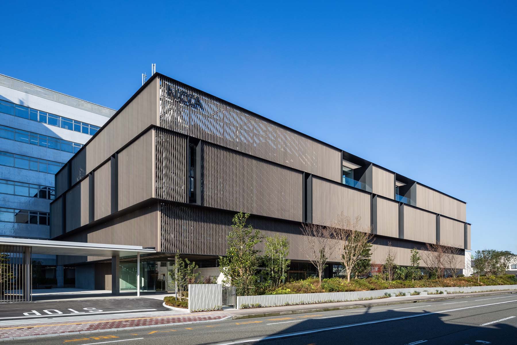
프로젝트에 임하며 Tetsuo Kobori Architects의 디자인팀은 어떤 공간이 반복되는 연구와 실험으로 지친 연구원들에게 자유를 제공할 수 있을지, 그리고 어떻게 하면 연구원들과 직원들이 서로 소통하며 지식뿐만 아니라 감정을 공유할 수 있을지에 대해 고민하기 시작했다. 이를 위해 우선 회의실, 휴게공간 등은 최대한 개방적인 구조를 가지고, 직원들에게 안정감을 주기 위해 최대한 자연적인 요소를 닮은 디자인을 공간에 풀어내는 것이 그 해답이라 판단했다.

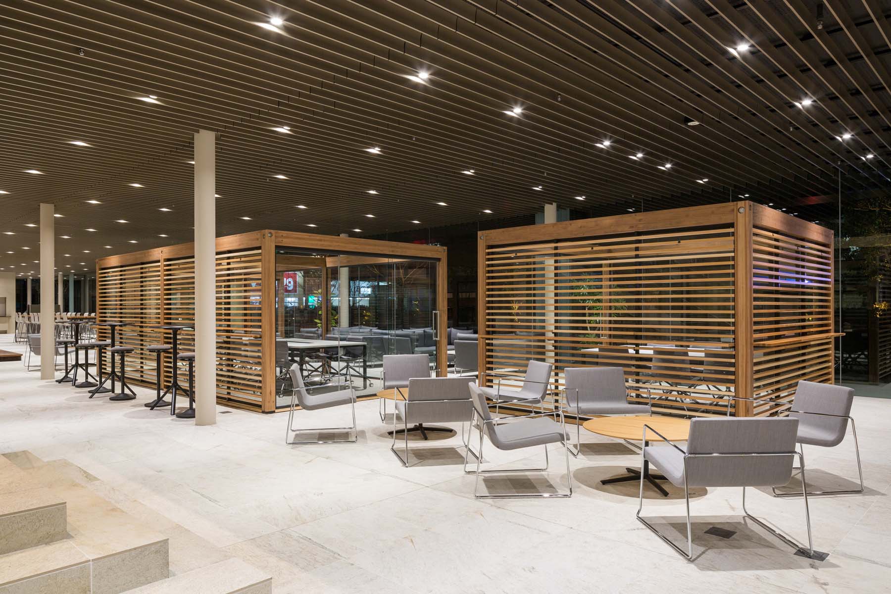
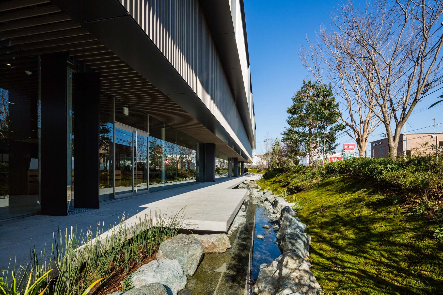
총 4층 규모로 새단장한 건물은 통로로 연결된 기존의 건물보다 훨씬 넓고 쾌적하게 디자인됐다. 층마다 장비실, 연구실, 창고와 사무공간이 배치됐으며, 1층의 개방된 넓은 공간에는 다양한 규모의 미팅, 휴식을 위한 좌석을 두었다. 차분한 톤의 바닥재나 가구와 대조적으로, 입체적인 루버 구조의 천장, 큐브룸은 공간에 생기와 재미를 불어넣는다. 넓은 글라스 월 너머로 푸른 잔디와 수로가 내다보여 고밀도의 연구작업을 이어가는 직원들은 자연 속에서 쉬는 듯 여유로운 시간을 가질 수 있다.
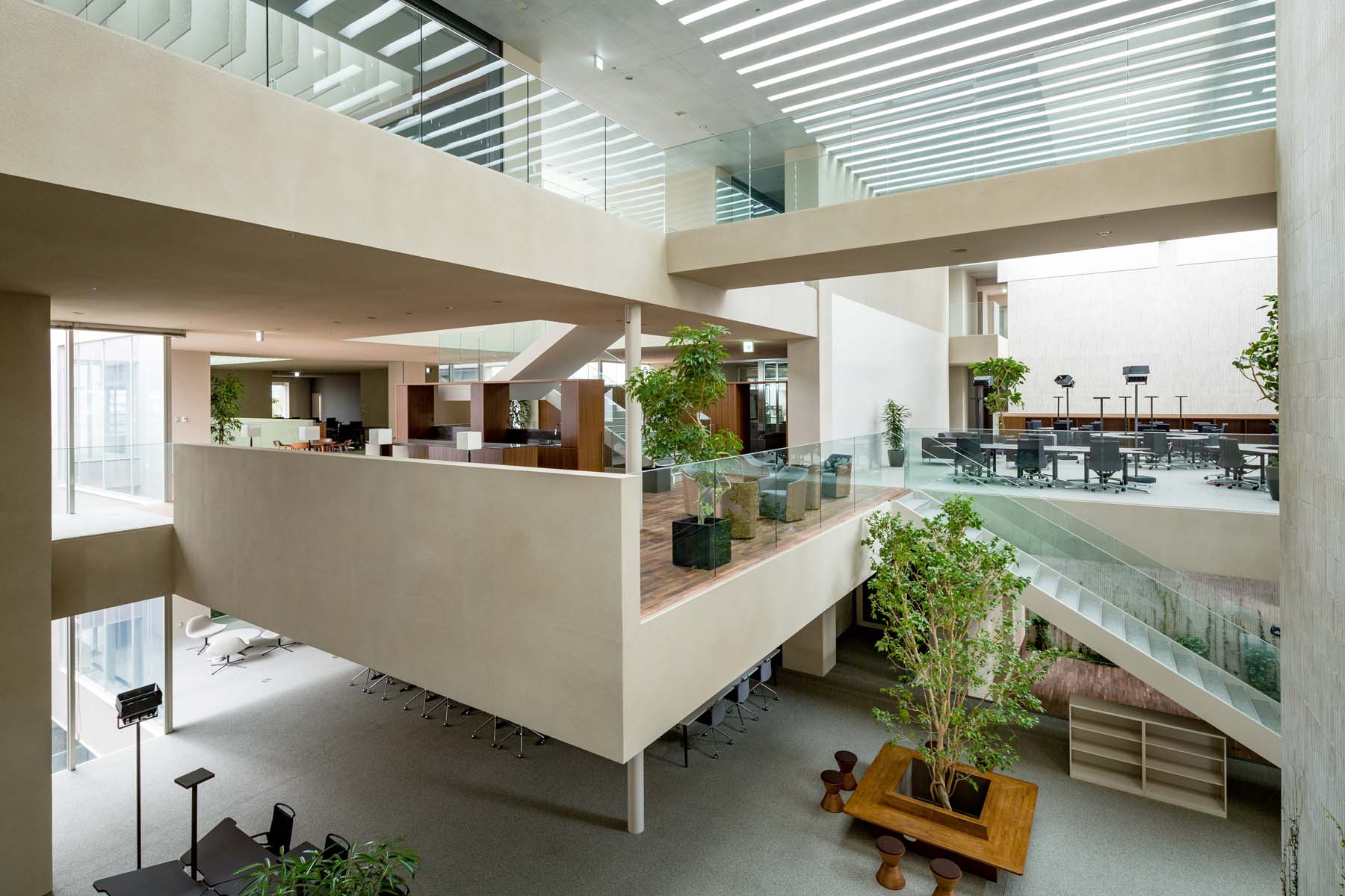
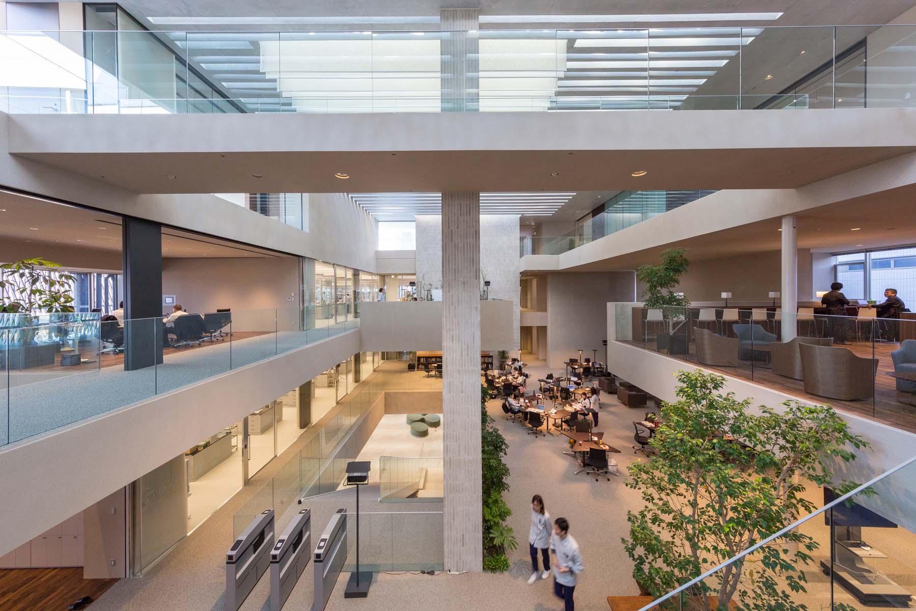
자극적인 컬러로 시선을 사로잡기보다, 무채색의 벽체와 바닥, 계단을 입체적으로 활용한 3, 4층의 분위기는 얼핏 도시 한복판에서 빌딩 숲 속을 헤매는 듯 착각하게 한다. 여기에 콘크리트 벽을 타고 오르는 푸른 식물들과 다양한 묘목들로 신비롭고 자연 친화적인 분위기를 더했다. 각 층의 회의실, 세미나실들은 대부분 투명한 유리로 구성했으며, 벽체가 없고 천고가 높아 개방감이 느껴진다.
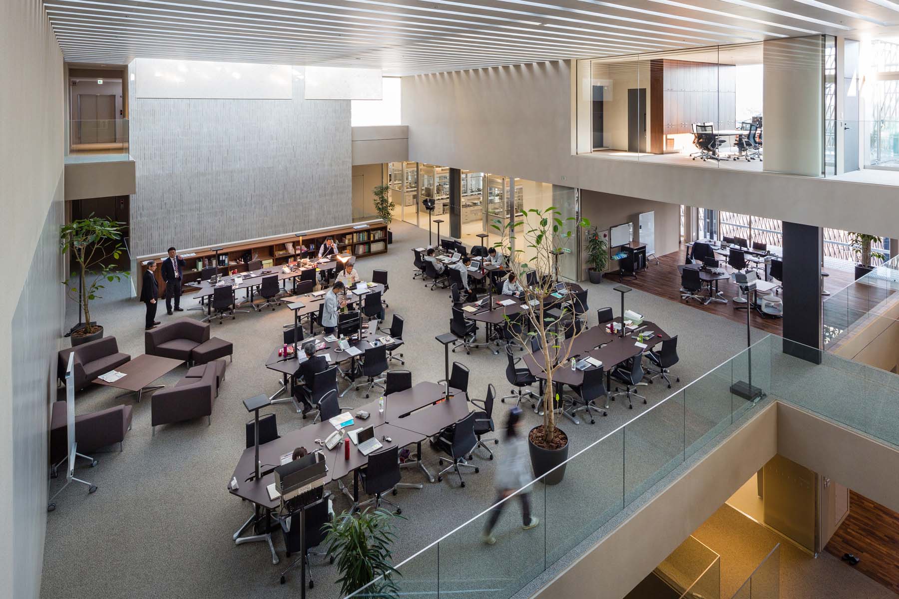

This is a plan to rebuild the firm’s research facility. The proposed site is an urban environment lined with residential houses. Despite the character of such an environment, we were asked to reate a facility that would be a source of innovation bringing people “from the world to Fukui.” We felt that in order to liberate researchers from the extremely individual activity of experimentation” and allow them to share their conflicts and direct emotions with others at the physical level, it would be necessary that any practical community space that enabled prototyping should be open. Therefore, we glassed in all of the laboratories that had previously been closed off and situated a “commons” in the center as a hot-desking office environment. The glass laboratories are linked seamlessly with the commons to produce rapid interactions while engendering the formation of an integrated research community. The commons is a space where people, the natural environment, activities, and tools are constantly in flux. We felt that a space that could be used for multiple purposes and facilitate active interactions by a diverse range of people would be an ideal concept for the new innovation center. There, as places where visitors and people from the community would be free to interact with researchers at NICCA Chemical, we set up a showcase, café, cafeteria, practical laboratory, hair salon, and hall.
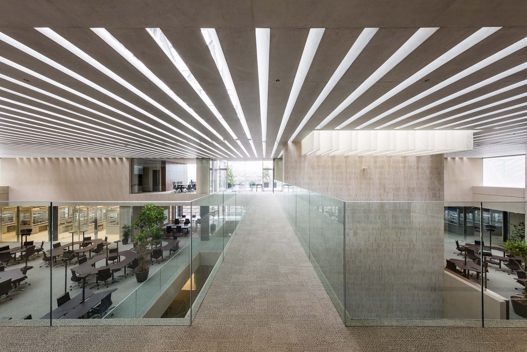
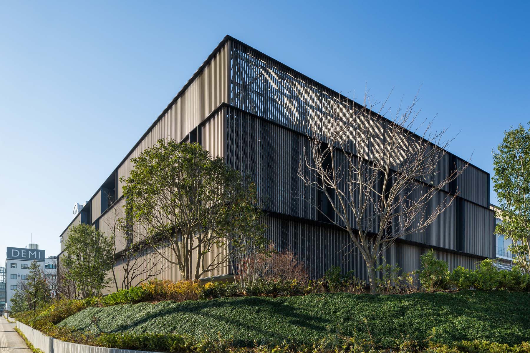
The concept is that of an urban “bazaar” – an open space effervescing with a lively atmosphere spilling out into the streets. In addition, the “street” running from the first to the fourth floor allows a bird’s eye view that enables a museum-like multi-layered experience of all of the building’s spaces. This street is intentionally made to be longer than necessary to elicit more encounters and emotions between researchers and others. In the commons where the researchers congregate, we used the concept of a “harvest” that incorporates the blessings of nature. To feel light shining into a cavern that, while filled with natural light, does not carry the warmth of the sun, the comfort of radiant air conditioning that makes use of groundwater, and the constant passage of the prevailing wind – we felt these to be physical sensations that the researchers would want. Slits in the concrete ceiling function as passageways for light, radiant heat, and the wind, creating a large environmental medium combining beauty with technology. The louvers on the façade hide the pipes while mitigating the sun’s rays from the east, filtering the surroundings. This delicate façade evokes a woven fabric to symbolize the textile industry with which NICCA Chemical has been closely associated, and which is also a major industry in Fukui. This fabric, enveloping the space in a tender embrace, constitutes an interface that expresses the identities of Fukui and NICCA Chemical and forges a link with the community and its lush green landscape.
차주헌
저작권자 ⓒ Deco Journal 무단전재 및 재배포 금지







0개의 댓글
댓글 정렬