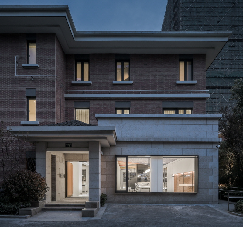
▲入口外立面 Entrance exterior elevation
Max Vision is a Belgian women and children’s garment brand. The Belgian male owner Jan settled in Ningbo as he like Chinese culture. The project is to design an office at a newly-built four-story house. Basement is only 1.9meter tall. The challenge of the project is to meet all office founctions in this residence limited scale building. For instance, how employees from different departments can work efficially;how to located reception, recruitment, meeting, discussion areas in this building. Moreover, how to bring exterior green enviroment into office legally to improve work enviroment. The owner also need a private child-parent space at 3rd floor which is isloted from work space.
The solution to the problem lies in the problem. We visited client’s factory and office twice to invisigate their process flow include design, sampling, photography, sewing, ironing, quality test and shippment. We also measured their equipments and asked empoyee about their daily flows and observe their daily work behaviours.
The first step was to renovate structure. We removed part of the slab beside entrance and installed a 8-meter display window. The purpose of display window is to use short storage basment as display also bring light to basement. The dramatic display window on the floor act as a signature of Max Vision. Models with in season garment were displayed at this window. Walking on the transparent runway, it is as if the models downstairs are constantly interaction.

▲车库打通变为开放办公 Garage becomes open office
The second step was to renovate external wall. For the first floor, we opened big window as possible to bring sunlight and landscape into office. Also, we built two walls at different levels at the end of yard and the yard was enclosed by this view. Well designed water flow was place between walls, shallow pool provide habitat for birds. Water, warm lighting and low walls create a peaceful picture at night.
The reason we built two “L” shaped wall separately was because enclosed wall not allowed due to property regulations. But we still want to have a definition and a certain sense of closure. Owner convinced the property company as two “L” shaped walls (the tallest one is 1.3 meter) can work as security partition.
The third step of our project was to removed garage walls at first floor to make office a transparent
space. Old staircase beside elevator was removed as it took up much space. An eyecatching spiral stair at center connected basement to third floor. Three departments also were divided by spiral stair.
We hope that the elements that each project presents are related to the space itself. The material we use is not only for visual looks, but also with functions. So our challenge is that how to present the unique genes of the garment company in the existing space. Or whether space design can be as characteristic as weaving clothes, but at the same time solving problems within the range of budget acceptance.
After much discussion and modeling, we decided to use 7000-meter long elastic lines to weave the entire office ceiling. At the same time, air condition pipes and electric wire are closed over by lines. As the layout of the wire looks randomly, works on site are hard to control. We calculated the rule of layout on computer and tested method of woven line both at office and on site. The finished lines at both first floor and second floor look geometry. Different colors overlap and form new colors.
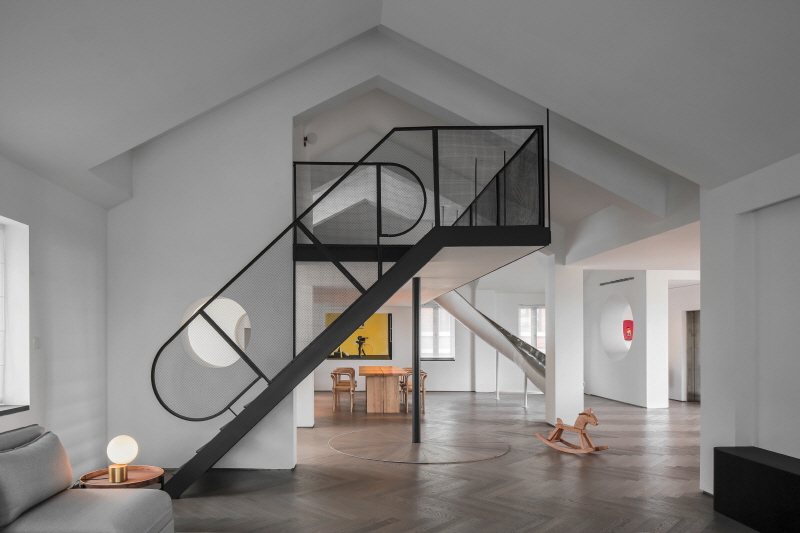
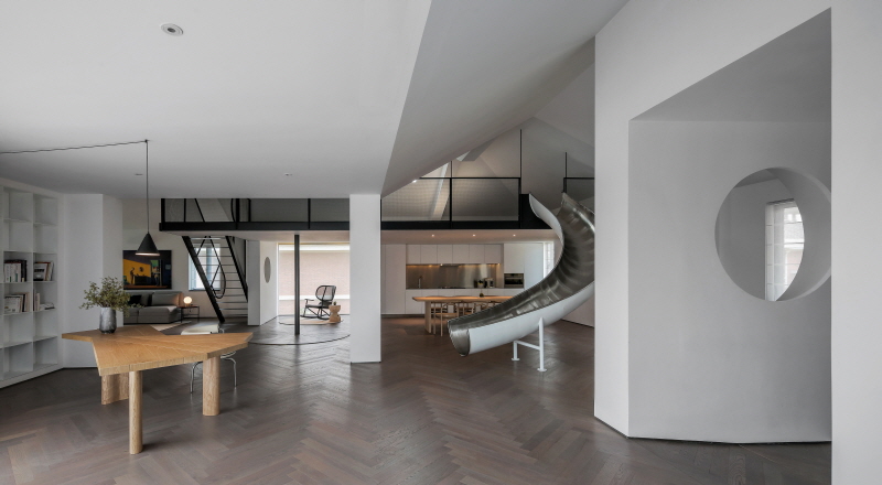
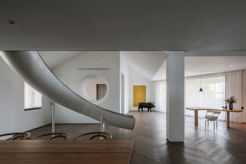
Owner couple need a private space for their family so that they can play with kid, read and meet friends after work. In the beginning of the project, we went to the owner's house to investigate and found a lot of functions that could not be realized there. We hope to achive that functions on the third floor. We built a loft to make better use of space as the highiest point of sloping roof is 4.5 meter. We designed both stair and a slide for the loft so their flows moves in cirlce. The combination of stair and slide is the best idea to let kid enjoy the space.
There must be enough space to meet our plan. We removed a column between balcony and indoor, then we installed two big silding doors sideway so the square balcony cut into half. The length of the diagonal line is the opening of the largest view of the landscape. Furthemore, the height of the 1.3-meter wall is lowered to 1 meter to ensure its high security while viewing the distant view. Kid can even ride bicycle at this large free space.
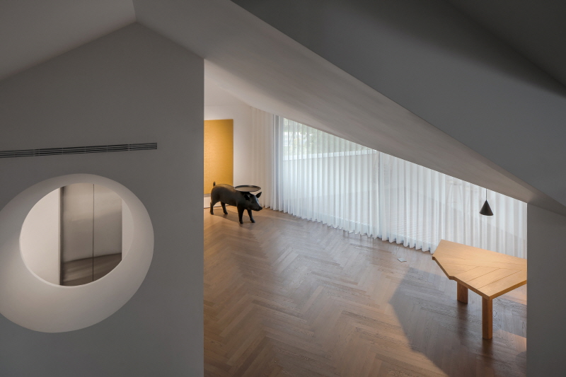
▲隔层看露台 View from loft to balcony
The ceiling structure is complicated so we build white painting suspended ceiling to cover up complicated lines and structure. Loft provide kid a place to play. We also opened skylight-window above loft to import airflow and light. The loft is the best place for owner to relax and watch stars with child.


0개의 댓글
댓글 정렬