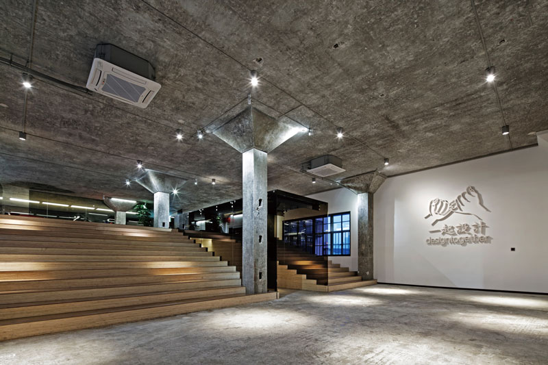
Faced with the old industry loft space with high ceiling, Lin decided to use a simple but ritual special distribution after sophisticated thoughts. He made the 12 -meter wide stairs as the core concept of the whole design so as to smartly extend the transitional usage of additional oors, making it possible for the space to both function in a connectedly exible and vertical way. The large stairs matched with the hall capability come into being a multifunctional reception area with party, communication and learning. The stairs stu ed have been considered as a media carrying countless events and memories. The vertical glass measurement is enmeshed onto the horizontal stairs, sharply forging a 12-meter long passage. It comes along from the outside toward inside, from the wide door hall into the relatively narrow aisle and at the end reach to the spacious bright work space. The space layout gives people a mixed feeling of initially cheering but then controlling and again cheering up vibes, with rhythmic moving process of a psychological hint that people start and nish the work in this very space within a day.
A fter ten years’ business foundation, MOMA Design has o cially changed its name into “Design Together”, newly headquartered itself into a tremendous space at M50 Shanghai with a combination of various featured design companies. This has launched the first case of two design top talents from different field coming together to cooperate in the o ce function project and eventually create the space together by Chinese pioneering architect Lin TsungJen and renowned furniture designer Hou Zhengguang.
With regard to the constructional material, designers adopt passages are decorated with composite boards and faultage, bringing the a plain architecture aesthetic to return an innocent yet real design idea. The post-industrial work environment differs from the mediocre metropolitan concrete office buildings, representing the most avant-garde creativity of the city. Hence the textures of the material has been given sophisticated thoughts and eventually erases the old oil paint surface and recover the original mud texture and add a bit wood material, naturally breeding a cohesive human culture atmosphere within the mixed texture of the walls and floors. Stairs and basic construal material into a higher premier space entirety. “Together” metaphor also lies in the assemble faultage overlap features. Space are decorated with green tea hue glasses and black iron items to create a strong modern design style and green plants walls and the sh tank brings a fresh nature air. The assembly of various natural materials makes the space raw yet refined, crafted yet naturally carved, concluding an entire space with deep quality of life style, which all comes back the very first design idea of Hou Zhengguang: Perfect fusion of working and living.
The illuminating design is accord with the original lights layout by using grid system so as to avoid the shadow caused by the pillars. Cabling channels smartly become the foundation of the LED light to refrain the mess of the cables and even matches the uncovered mud ceiling into the style of well-organized modernity. Underneath the additional stair board are adorned with neutral color light belt with high luminance. The collateral equipment offers mild light and meanwhile has solved the illumination problem in the limited space. In the important reading area there will be pendant lights and projection lamps alongside the mud pillars to build cube e ect and sense of space depth like a gorgeous dramas stage setup with high ceiling. Designers give meticulous thoughts on some detailed parts such as the pillars’ edge is dealt with round shape given both the security and aesthetics. Bathroom project is carried with the idea of “design together” yet “harmony in diversity”. Industrial style designed wash basins go with the di erent kinds of water taps and urinals to grab the whole space design concept and at the same time enthusiastically a perfect multi- visual pleasure amongst the various function and zones.
차주헌
저작권자 ⓒ Deco Journal 무단전재 및 재배포 금지


0개의 댓글
댓글 정렬