HARMAY XINTIANDI - AIM ARCHITECTURE ©Dirk Weiblen, Sun Liwen
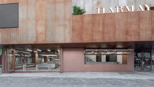
AIM architecture continues to innovate retail and consumer experiences. Harmay's Xintiandi location blurs the line between luxury and commodity, need and want. Supermarkets and grocery stores are one of our most common shared experiences as humans. A trip to the market is synonymous with daily life, and for most of us, triggers strong emotional responses. Luxury shopping, on the other hand, has a more elevated quality that for most, is taken in doses. In Shanghai's Xintiandi neighborhood, the new Harmay Market by AIM Architecture fills the liminal space between the everyday and aspirational.
HARMAY XINTIANDI - AIM ARCHITECTURE ©Dirk Weiblen, Sun Liwen
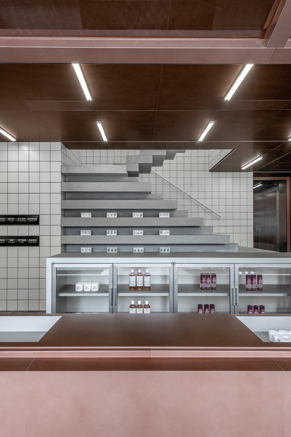
Formerly an open-air wet market, Xintiandi received its urban glow-up a few years ago, like many Shanghai neighborhoods, and now is a popular destination for both locals and tourists to get a luxury shopping fix, peoplewatch on the ped mall, or grab a bite at a top-tier eatery. Harmay Market sits at its heart, in powerful contrast to the glamour that surrounds it. Inspired by local markets formerly scattered throughout the neighborhood, Harmay Market is intentionally designed to stretch beyond the expectations of a high-end shopping district. It's a buzzy, high-energy supermarket selling, among other things, both face masks and milk. From the outside, big flipup windows engage shoppers from in and outside the store. With over 600 m2 spread over 2 floors, it captures the emotional feeling of shopping in an open-air market, and the excitement of luxury retail.
HARMAY XINTIANDI - AIM ARCHITECTURE ©Dirk Weiblen, Sun Liwen
HARMAY XINTIANDI - AIM ARCHITECTURE ©Dirk Weiblen, Sun Liwen
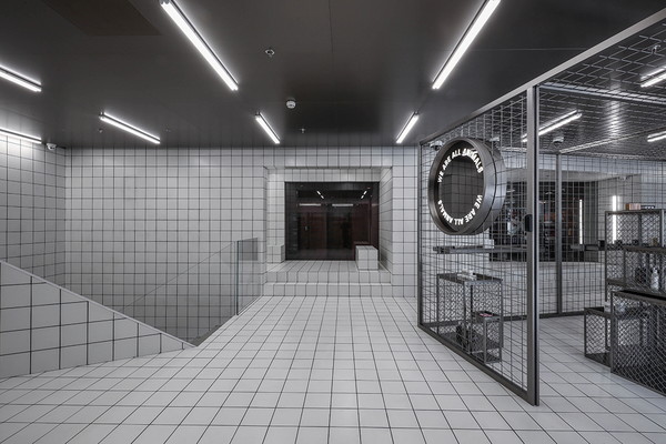
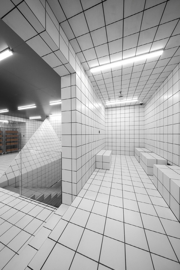
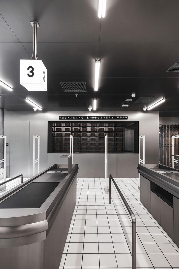
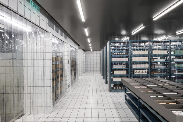
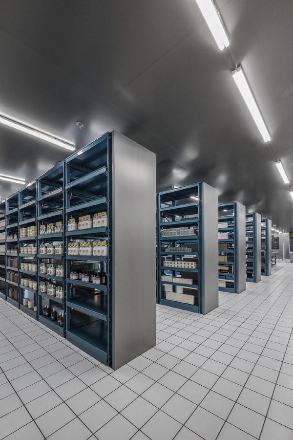
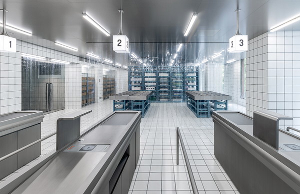
The facade allows passersby to see the goods as they pass, or stop to inspect the merchandise, enticingly displayed on the 'produce table'. Although Harmay is a cosmetics retailer, the products for sale in this market aren't just mascaras and body creams. In true market style, shoppers can select from an eclectic array of goods ranging from beauty products to bananas. The second floor houses storage - as with all Harmay locations, the store functions both as a brick and mortar shop and an e-comm fulfillment site. Evoking the dry goods section of a supermarket, open faced tables and tall painted steel shelves pull double duty as storage and display. Clean white tile covers the floor and some walls, giving the space a fresh, modern vibe. Clear plastic curtains, a familiar call back to a classic grocery, help divide the space. Once shoppers are ready to buy, they even go through the checkout line. In the cage, shoppers can find products not tested on animals, and the space is just that: a cage.
HARMAY XINTIANDI - AIM ARCHITECTURE ©Dirk Weiblen, Sun Liwen
HARMAY XINTIANDI - AIM ARCHITECTURE ©Dirk Weiblen, Sun Liwen
HARMAY XINTIANDI - AIM ARCHITECTURE ©Dirk Weiblen, Sun Liwen
While shoppers will immediately recognize all the hallmarks of a supermarket shopping experience, the Cage's design is intended to throw off familiarity and comfort. A mirrored sign declaring We Are All Animals drives home the point. Discomfort clashes intentionally yet subtly with the rest of the experience. Shopping in Shanghai is as dynamic as the city itself. High mixes with low, glitz rubs up against grit. The different daily desires of the shopper are what drives the experience of Harmay Market, and asks the question: what is luxury, and what is a commodity? The spirit, and fun, of the store's design lets shoppers answer that question for themselves.
HARMAY XINTIANDI - AIM ARCHITECTURE ©Dirk Weiblen, Sun Liwen
이색적인 코스메틱 샵, HARMAY XINTIANDI
- 최윤선 기자
- 2021-09-11 16:26:33
- 조회수 1194
- 댓글 0
최윤선
저작권자 ⓒ Deco Journal 무단전재 및 재배포 금지


0개의 댓글
댓글 정렬