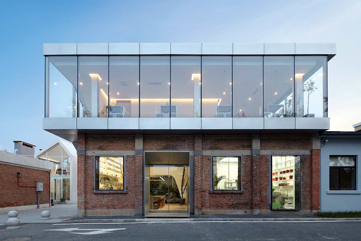

The site is located in a special border area between the city center and the suburbs, around the 5th ring in Beijing, China. It's also an industrial block which has plenty of red brick warehouses that supported the Spinning Era in the 1960s. It is undergoing various renovations to a new commercial area, and our project is to renovate one of them. The clients already own a relatively small shop in the city center, which sells beverages made only from organic plants. They are undergoing an extension of their business which not only sells beverages but every prospect of healthy food, so they have bought one of the red brick warehouses as the main studio+food bar, and have asked us to design it.


A two storey building was requested, including a food lab, dining space, sales space, workshop area, a gallery for the artists working in the team, office zone, and a greenhouse. Inspired by the clients' strong interests in natural ecosystems, including lots of plants in the greenhouse, we have tried to actively introduce the outdoor space into the indoor space. As part of a retail area, it's important to display a popular and busy atmosphere inside to be seen from the outside to attract more guests. Therefore, we have designed our project according to the 8 rules below. All of these rules have a multiple perspective, so that the resulting space is as emotional as possible.


With the consideration of the layout for various functions, the optimized spatial quality is designed to coordinate with the exterior environment. The lab and retail space, which are expected to attract daily customers, are allocated in the north side of the 1st floor plan. They are visually recognized from either the street or the interior. The warm-house, whose sunlight exposure and soil management need to be seriously thought of is allocated in the south side in order to gain enough sunlight. The art pieces displayed in the gallery are placed with the glass next to the street on the northside of the 2nd floor, avoiding direct sunlight. And on the southwest side of the 2nd floor, a workshop space for private gathering is set.


The building is also an experiment that is trying to study a mixed publicity and privacy condition. The customer traffic flow is blended from exterior to interior space, bringing the transforming resolution between publicity and privacy. Follow the up-lifting staircase and walk to the terrace on top, the view of Beijing's skyscrapers construct the environmental urban sense for the sub-urban area building. Through inserting a different element, ie. the nature out of the dense urban environment, it is believed that individual private spiritual motion gains the opportunity to be freed and released.


ECHO HOUSE
- 이지민 기자
- 2021-02-03 14:41:06
- 조회수 733
- 댓글 0
이지민
저작권자 ⓒ Deco Journal 무단전재 및 재배포 금지







0개의 댓글
댓글 정렬