
JG PHOENIX recently completed a new restaurant in Shantou City, Guangdong, China. "The client and I are friends for many years. He has been involved in catering industry for decades and often recalls people's simple pursuit of the taste of food back to the late 1980s and the early 1990s. The taste of food in our memory is common and intimate, which inspired me in the design. For post-80s generation, home in memory is usually associated with terrazzo floor, old wooden furniture, black-and-white photos, old-style radio bathed in sunlight at dusk, and the aroma spreading from kitchen...Those simple scenes gradually came into our mind as conceiving the design. I believe that space is a place for emotional attachment. For this project, I tried to incorporate past memories and the client's understandings of taste into the design, and return to simplicity." The chief designer Ye Hui said.


Based on analysis of the original spatial structures, JG PHOENIX identified that the key of the design was to connect the four above-ground floors with the underground space. Considering functional demands and the laws of natural light, the design team intended to break the clear boundary of each floor and set staggering ceiling heights, so that every floor can interpenetrate and integrate with the upper and lower storeys, hence broadening the field of view. In addition, large areas of French windows and translucent materials introduce natural light while ensuring privacy to some extent.


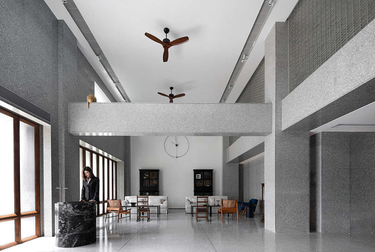
The waiting area on 1F is a double-height space. The designers removed the original floor slab above this area, and at the same time preserved the main beam, on which the artwork "Naughty Cat" created by artist Chou is placed. The artwork interacts with the reception desk, and enlivens the spatial atmosphere. Terrazzo boards are applied to large areas of the space. White tableware is put on brass panels in an orderly manner, which extends the space visually. The glass brick wall on 2F is embedded into the beam structure, bringing in light whilst ensuring privacy of the space. The human figure sculptures wearing Chinese tunic suit hold head high, seeming to tell people the positive living attitude in the past. Opposite to the sculptures are 64 orderly-arranged pieces of kitchen ware. Made in Indonesia, those old kitchen utensils not only imply the "overseas Chinese" culture of Chaoshan area, but also carry overseas Chaoshan people's longing for hometown cuisine.


In a private dining room on the first floor, the design team added a frame to the existing beam. François-Xavier Lalanne's artwork "Singe attentif" squats in the frame and overlooks the sky, echoing the past scene where kids sat on old threshold and imaged what they hoped to be when growing up. The seating area extends the air-faced concrete wall and inherits the plain texture, which forms contrast with the wall featuring wood cladding. The designers hoped to show the passage and trace of time via changes of material textures. 3F accommodates several private dining rooms. A functional box composed of about 1,000 walnut wood bricks erects at the entrance area, and supports the white wall above. The dining area is double-height, showing strong visual contrast with the tea drinking area that has a low ceiling. The change of materials defines the boundaries between different areas. The designers didn't adopt unified surfaces clad in same materials, but instead created diversified structural sections to enrich the space.


Public passages are unified by gray terrazzo, which is an element frequently used within the entire space. Black handrails and steel panels with archaized grain convey the message about the passage of time. Like the connection point in a time tunnel, the grid-like glass wall generates illusionary visual effects. Several swallow-like artworks created by artist Zhou are set right beneath the ceiling of the passage, seeming to fly to the outside world. The underground dining area adopts dim lighting and point sources of light, to create a cosy, serene atmosphere. The colour of light on the mezzanine is full of changes, adding a mysterious ambience and appeal to the dim space. The reflective stainless steel visually elevates the low ceiling of the underground floor, hence alleviating the oppressive feeling in the space. The walnut-wood screen separates the routes of light, and generates changes of light and shadows.


TIME MEMORIES
- 이지민 기자
- 2021-02-03 14:39:06
- 조회수 914
- 댓글 0
이지민
저작권자 ⓒ Deco Journal 무단전재 및 재배포 금지


0개의 댓글
댓글 정렬