#24 Cathay Restaurant, innovatively redesigned by Jaco Pan of Minggu Design, is located at Guochuang Park in Nanjing City, China. This historical park is adjacent to Ming Great Wall on the west and Qin Huai River on the east. The site had originally been the Silver Dollar Bureau of Jiangnan Region in the late 19th century before transformation to work as the Secondary Machine Tool Plant Nanjing in the 1950s. Extending nearly 130-year industrial context, this place’s been maintained and updated after the public realization of the reversion of old relics. Today, it’s become a foundation developing culture and creation in the local.
24 presents the twenty-four solar terms in the Chinese tradition of meteorology, suggesting that the restaurant uses seasonable fruits completely while auxiliary with today’s cooking tricks to give a rebirth to the Huaiyang Cuisine. This is also the intact purpose why the owner hopes to operate the restaurant there. Thus, the architect was commissioned to transform the existing old building in order to blend the essence of the brand seamlessly into a new space where visitors are able to celebrate the elegance and tranquility, while keeping the ambiance creative and pleasant.
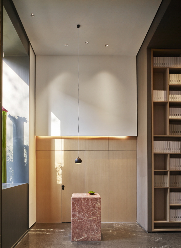
The layout appears opening up both to the west and east sides in form of a deep rectangle. One of the entrances ruling as the main access is close to the roaring avenue, oppositely, another to the standalone inside of the park.
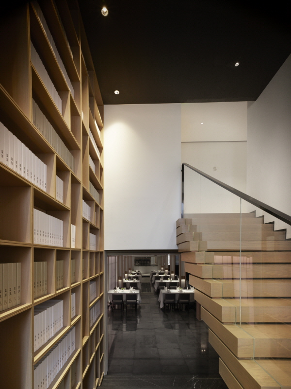
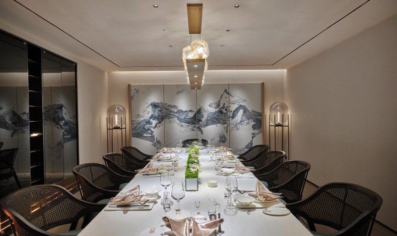
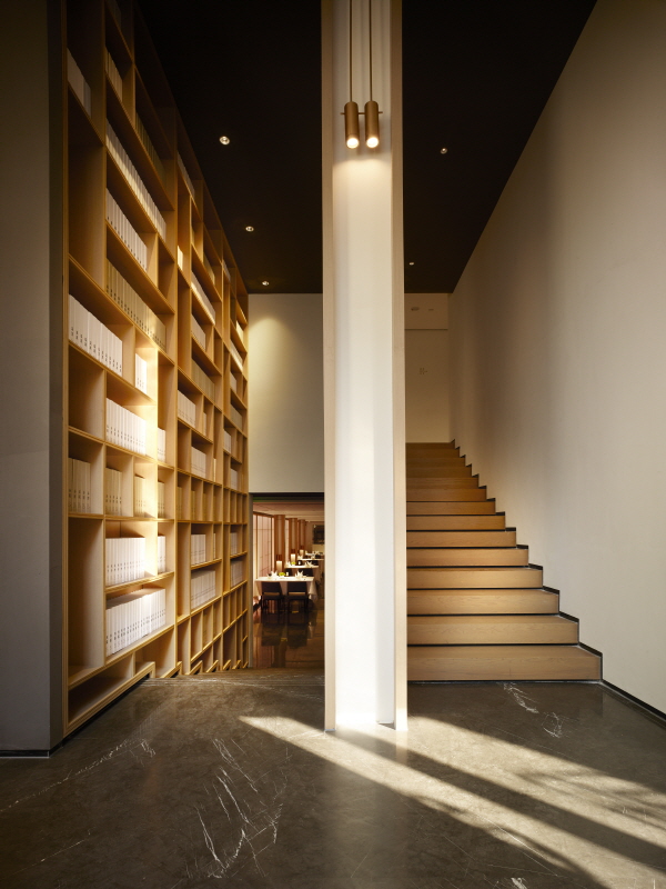
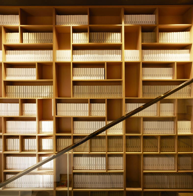
A single-storey building with a height of 10 meters was divided into three parts: the ground floor serves as public dining area and semi-open kitchen with supplementary floor height down to the underground; 6 private dining rooms and 1 teahouse & library combination are separated into the north and south sides of the corridor on the second floor; the third floor consists of offices, workplaces, and several independent private dining rooms.
Visitors will find the interiors have a wise composition and explicit functions. But the circulation presents much interesting to get people an interlaced vision of placing themselves in the dreamland. The variational arrangement makes an ambiance that leads diners to experience the course of exploration of curiosity to openness and clearness. This unforgettable tour helps people forget bustles and noises outside and reach the core of the restaurant.
The entrances on the two sides feature characteristics respectively. The main entrance facing the main street features giant dark eave extends outward. 2 tremendous natural slates and a row of bamboo-made barrier beneath the roof form a spontaneous transition.
A large number of floor-to-ceiling glasses were used to make up the façade. The brand sign suspended on the right corner of tall narrow and massive wood door stays non-conspicuous intentionally. The relative position of timber door on glass façade was examined carefully, which directly faces the entrance to dining rooms of the restaurant on the ground floor. For one thing, passengers passing by the avenue can easily catch sight of the chic ornament in the lobby but not get access visibly to the public dining area; for another, necessary privacy is retained while introducing natural light into the room.
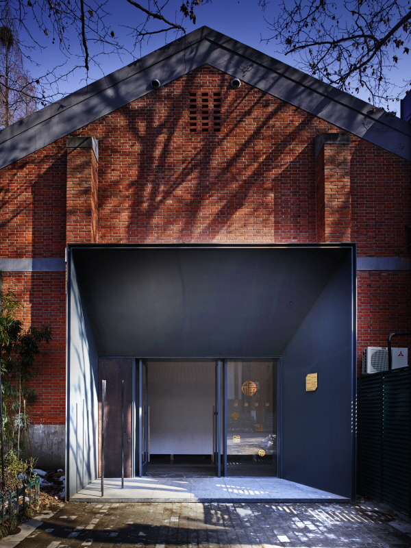
The entrance on the west side is totally different. Three giant darkened sections built in the common brick façade focus the entrance to the enteral place. Contrasting with the exquisite brass-made logo, it endows a sense of modern industry.
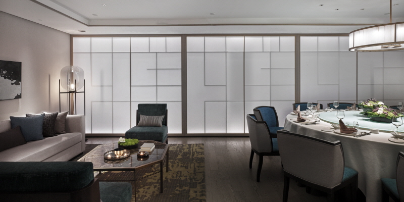
The overall hue of the restaurant manifests elegant. Walls and ceilings are mainly covered with white painting and light-colored wood. The public area is covered with cool dark stone, while the private rooms have relatively warm solid wood floorings. The functional areas are unaffectedly separated visually and perceptibly.
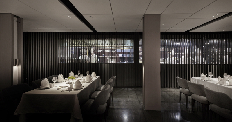
Entering the restaurant from the main entrance, visitors reach the ground floor via the lobby. In this sunken space, the common dining area and the semi-open kitchen reside in parallel. The architect hopes that the relation between the diners and the kitchens at this moment can be standalone and associated, which could be expressed in a more informal manner as "Broken Up". bar-shaped dark steel plates are arranged longitudinally to form a grille on the glass facade of the kitchen. In this way, during the course of the shuttle, the grille in marching forward direction completely blocks the sight, and it is visible only when standing and facing against the grille.
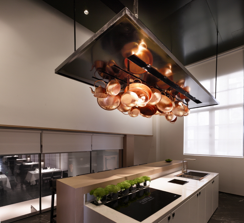
On the other side of the public dining area, the architect used a screening wall made of rice paper to block the messy light and mottled walls out of the dining space. The slightly rough surface of Chinese art paper softens light and shadow.
In order to introduce the idea of "bamboo forest" into the interior from the outside, the architect set up a number of perforated black metallic tubes inside and outside, and light sources were placed in the tube to simulate the shape of the bamboo. When night falls, dim light oozes out of the hole in the metal pipe, just like the fireflies in the bamboo forest in summer night, blurring the bound of downtown and countryside and yearning for the nature meanwhile.







0개의 댓글
댓글 정렬